Benjamin Moore 2022 Colours of The Year: Our Faves
If you’re thinking of giving your home a bit of a face lift, paint can be the easiest, most cost effective place to start. And let me tell you, The Colour Trends 2022 pallet by Benjamin Moore has some gorgeous colours that will definitely bring some life to your space!
What I love about this palette
I’m really into the trend of soft and muted, earthy, warm colours this year, and this palette is all of that.
- The neutrals are a great addition to a space to add a cozy warm feel, while still allowing your personality and decor shine through.
- Any of the greens would make a great upgrade to kitchen cabinets.
- The bold colours would make for eye-catching feature walls.
- It may be my recent vacation talking, but add a bit of greenery to the palette and it just gives me warm tropical vibes!
Here are my top 3 faves from the 2022 catalog:
Mysterious (AF-565)

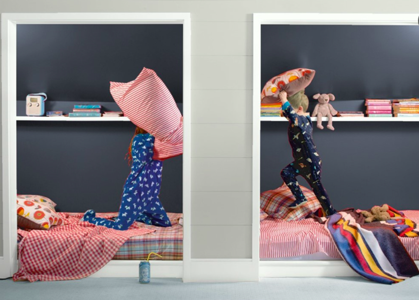
How I would have LOVED to have these uber-fun built-in beds when I was a kid! The idea of turning this once-was double closet into a kids sleeping nook (you know how I love me a good nook) is made that much more awesome by painting the interior walls in the bold Mysterious. It adds warmth, drama, and goes that extra step towards giving this kid-friendly sleeping area the feel of being in a world all of their own.
October Mist (CC-550)
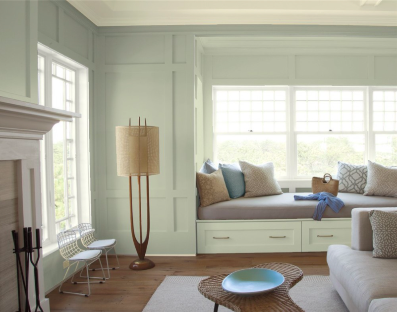
I am totally on board with October Mist being Benjamin Moore’s colour of the year. This soft, warm green adds a hint of colour, without being overpowering. It adds a feeling of serenity to a cozy space like this living room, and would equally be a fun addition of colour to a kitchen when used on the cabinets.
Venetian Portico (AF-185)
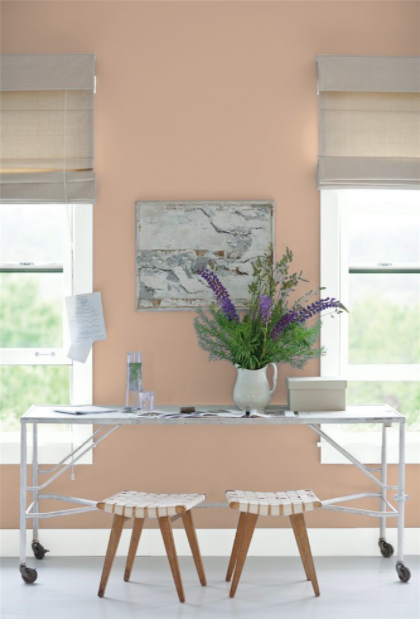
I love, love this colour, and it’s now on my list of faves to use in my office! Venetian Portico makes this space feel welcoming, friendly, and would make me happy to hunker down and get ‘er done. The peachy tones are also made slightly more subtle by the addition of a hint of brown, which gives it a more adult vibe.
Which colour do you like best, and where would you put it in your space?
Happy painting, and don’t forget to share!
xo Michelle
